Cultivating a New Era of Farming
Cultivating a New Era of Farming
A Brand Identity for a Start-Up Reimagining the Farming Industry
A Brand Identity for a Start-Up Reimagining the
Farming Industry
Cultivating a New
Era of Farming
A Brand Identity for a Start-Up Reimagining the Farming Industry
Client
Aggregation Agriculture
2023
Scope
Brand Strategy
Brand Identity System
Team
Agency: AdvoGlobal
Role: Lead Designer
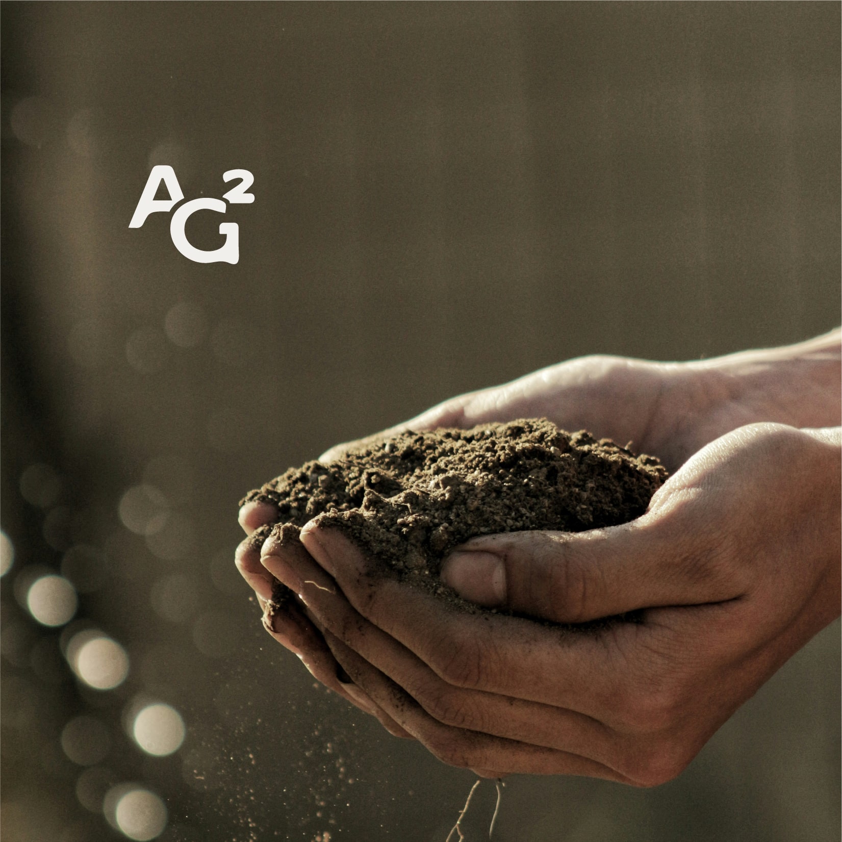
Aggregation Agriculture is spearheading a new era of farming, using regenerative practices to teach farmers and ranchers to work with nature, instead of against it.
I led the creation direction and brand design, guiding the overall vision of the project from concept to execution.
We started with an in-depth discovery phase, exploring the intended feel, culture, tone, and voice of the brand. Our goal was to ensure that Aggregation Agriculture would resonate as a trusted, knowledgeable partner in soil health.
Our agency began by immersing ourselves in the world of agriculture, particularly the values and goals that matter most to farmers and ranchers.
Rooted.
Timeless. Restored.
MOOD BOARD AND STYLESCAPE
We landed on the keywords "rooted," "timeless," and "restored" to guide our process and visual language because they captured the essence of Aggregation Agriculture’s mission: grounded in the heritage of farming, committed to regenerative practices, and focused on revitalizing the land for future generations. These words embody the authentic, genuine, and trustworthy feel we sought to convey.
A range of assets was collected to curate a mood board and stylescape, using the brand’s essence to craft a cohesive visual language that would define the look, feel, tone, and identity. Multiple personas were created to represent target market segments, helping to address the unique perspectives and needs of those who tend to the land.

Our agency began by immersing ourselves in the world of agriculture, particularly the values and goals that matter most to farmers and ranchers.
We started with an in-depth discovery phase, exploring the intended feel, culture, tone, and voice of the brand. Our goal was to ensure that Aggregation Agriculture would resonate as a trusted, knowledgeable partner in soil health.
We started with an in-depth discovery phase, exploring the intended feel, culture, tone, and voice of the brand. Our goal was to ensure that Aggregation Agriculture would resonate as a trusted, knowledgeable partner in soil health.
Our agency began by immersing ourselves in the world of agriculture, particularly the values and goals that matter most to farmers and ranchers.
We started with an in-depth discovery phase, exploring the intended feel, culture, tone, and voice of the brand. Our goal was to ensure that Aggregation Agriculture would resonate as a trusted, knowledgeable partner in soil health.
Rooted. Timeless. Restored.
MOOD BOARD AND STYLESCAPE
We landed on the keywords "rooted," "timeless," and "restored" to guide our process and visual language because they captured the essence of Aggregation Agriculture’s mission: grounded in the heritage of farming, committed to regenerative practices, and focused on revitalizing the land for future generations. These words embody the authentic, genuine, and trustworthy feel we sought to convey.
A range of assets was collected to curate a mood board and stylescape, using the brand’s essence to craft a cohesive visual language that would define the look, feel, tone, and identity. Multiple personas were created to represent target market segments, helping to address the unique perspectives and needs of those who tend to the land.


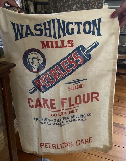


Inspired by Classic Vintage Styles
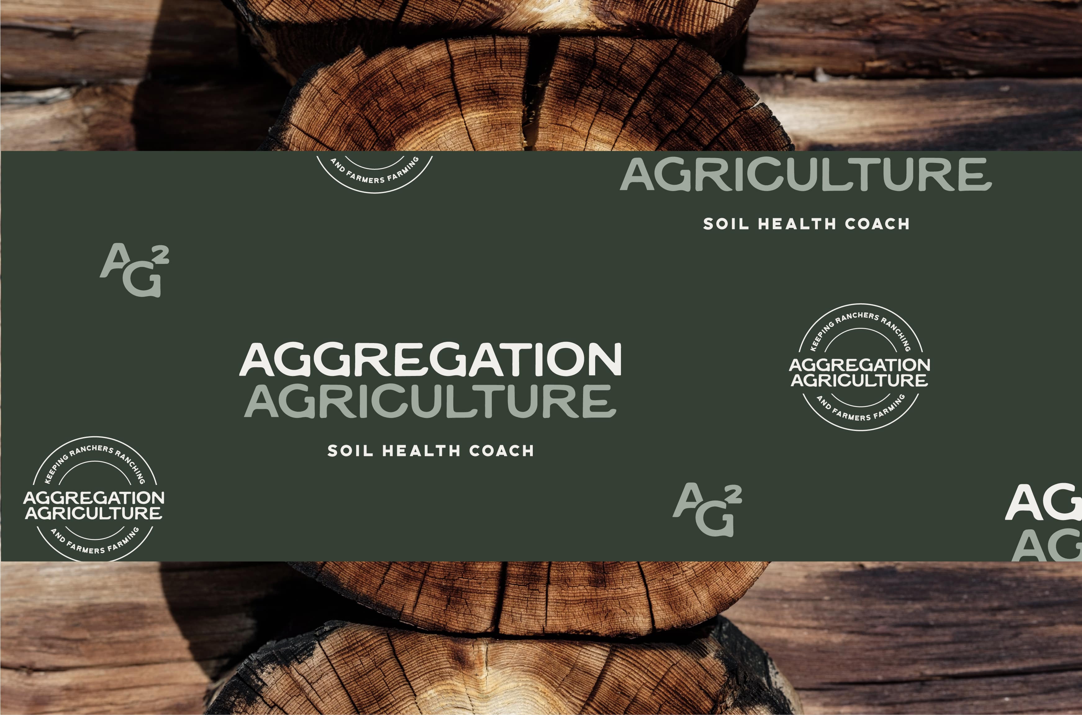
Drawing inspiration from the classic vintage styles of the 1800s and early 1900s, we saw value in the logo typography reflecting a timeless, heritage look with a restored, modern feel.
Inspired by Classic Vintage Styles
Drawing inspiration from the classic vintage styles of the 1800s and early 1900s, we saw value in the logo typography reflecting a timeless, heritage look with a restored, modern feel.
The Brand Identity
Guided by our research, we crafted a brand identity that is rooted in farming’s deep heritage while embracing a modern vision—reflected in the 19th century-inspired typography reimagined with a contemporary feel, and in the company’s steadfast commitment to teaching regenerative farming practices that restore soil vitality for future generations.
Guided by our research, we crafted a brand identity that is rooted in farming’s deep heritage while embracing a modern vision—reflected in the 19th century-inspired typography reimagined with a contemporary feel, and in the company’s steadfast commitment to teaching regenerative farming practices that restore soil vitality for future generations.